By Poly, Solution Sales Specialist at Flat Rock
Colour perception has always been one of the most commonly discussed topics when developing a marketing concept. The choice of a colour scheme depends on the audience that your business is targeting. Picking the right website colours will grab your users’ attention at first sight and as long as they enjoy the navigation through it, that will create positive emotions, which they would later on associate with your products. Getting the right colour mix can easily create the difference between a repeated customer and a one-time visitor.
Spectrum of colour meaning
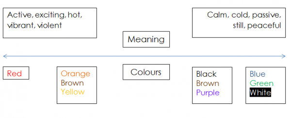
Colours are perceived by the different nations in various ways. However there are some colour aspects that are similar to most nations. According to a research conducted in the University of Paisley, there is a spectrum of colour meaning that can be described using the below diagram:
The colour meaning spectrum will be optimally used especially when discussing products/services that will be offered on the international market. Based on that information, we can easily pick the colours that correspond to the emotions towards our products that we will expect to create in users.
Colours that will boost your online sales
Using colours accordingly is your first step to more converted clients. The meaning behind colours is the reason why it is very uncommon to find a kid’s shop painted in black or a corporate website in bright colours. But what do colours really mean?
Black
This is a colour associated with power, dominance, precision and confidence. It is very often used for luxury products, formal clothes, jewellery and any product that will associate with high society status.
White
It is a symbol of purity, clarity and freshness. It is suitable for cleaning and sleep-related products, but at the same time it is often used for art shops, galleries and home décor websites.
Blue
This is one of the most commonly used colours on the net, especially for any kind of business related websites – insurance companies, finance institutions, enterprise networks, etc. It is a symbol of peace, trust and productivity. After the great Facebook era, it has become even more wanted then before. However there are some areas where it should be avoided. For example restaurant websites, as it is believed that blue decreases the appetite.
Green
A very positive colour, which brings the feeling of relaxation, safety, nature and harmony. Again, this is a very common colour for corporate websites, but it’s mainly used for everything associated with nature and natural products. A preferred combination is with white and brown.
Red
As one of the most distinctive colours, it is very often used for call to action buttons. It taps into the deepest emotions of customers and since red is associated with love, passion, excitement and energy, all e-commerce platform tend to use it in one or another element. But be careful – too much red on the website may become visually overwhelming.
Brown
If not used correctly, it may cause you a lot of troubles. Used in a combination with a bright colour, it will help you highlight some of the more important website elements. It is a perfect choice for a pastry shop, furniture and why not an open air event.
The fact that every colour brings a special meaning and alters the context of the website explains why these days more and more ready design templates for CMS and e-commerce platforms are offered in various colour schemes. In this way every business owners will easily change the template colour based on his products without the assistance of an actual designer.
We, at Flat Rock, will be happy to consult you on picking up the right design and colours for your new online shop. Do not hesitate to contact us at [email protected] or give us a call on 02071938298.

